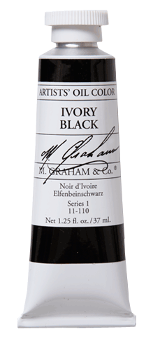
When I teach painting workshops, students are often surprised to discover that I use black as one of my usual palette colors. It seems that some art books have discouraged against using black, but I’ve found it to be a great addition to my palette.
After graduating from college with a degree in commercial art, I still had a lot to learn about fine art painting. Around that time, I bought the brand new book Alla Prima by Richard Schmid. In the book, Schmid lists the palette colors he most often uses. I adopted most of his list and set out to learn how they all worked together. Black wasn’t a color he listed, so I learned to make it by mixing other tube colors together — a valuable lesson. (By the way, chime in below if you’ve experienced the joy of making Schmid’s color charts. I think I spent two months on mine.)
A few years later, I had the opportunity to watch a live painting demonstration by Scott Burdick. He masterfully painted a portrait from a model outdoors using a limited palette. It was the first time I had ever seen anyone paint with a four-color palette. You may have heard of the four-color “Zorn palette” named for Swedish artist Anders Zorn. Scott used a similar palette that day: Titanium White, Cadmium Yellow, Cadmium Red and Ivory Black.
Scott’s painting blew me away. I had no idea of the range that could be achieved with so few colors, especially with one being black. Afterwards, I set out to experiment with the Zorn palette and other limited palettes myself. The pictured painting is one that I did from life using the four-color palette that Scott used.
I soon added Ivory Black to my regular palette after seeing the range of colors I could make with it. I continue to use it for studio painting as well as plein air painting.
I think the only danger to be aware of is that any color can become a “crutch” if not used properly. An artist could easily use black as a lazy choice for darkening colors in every situation rather than simply using it as a dark color that is cool in color temperature. (An early crutch of mine was Sap Green. Since it’s such a normal-looking green, I used it to make all the greens in my paintings and didn’t really analyze and mix the exact green I needed. So I replaced it on my palette with Viridian — a much more unusual green which usually requires mixing with other colors to make the exact green I need.)
Were any of you taught to avoid using black? Have you rebelled and used it anyway?

15 Responses
Wendy Corbett
Yes I was taught not to use black and like you I avoided it for many years. In more recent times I’ve become braver about not following the rules and I think my painting has improved. I do use black because sometimes it’s just the right colour to use!! I do try to use a limited palette especially when painting plein air.
Jill McGannon
I just got out of the sap green rut, and replaced it on my palette with black, which I use as another blue for mixing greens. I too think my paintings have improved.
Dan Schultz
Thanks for the responses, Wendy and Jill. Did you do Schmid’s color charts? I thought I would see more comments about those!
Sarah
I was first taught to use black to make every dark. Obviously that wasn’t great! Then in college I was taught not to use black ever. Now I use a little bit at times. Interesting to read about this from a professional artist and see everyone’s comments. Thanks!
carol costello
I recently used the “Zorn” palette at a William Schneider Workshop and I was really surprised at the skin tones you can make.
Aslo, I have started the Schmid Color Charts……..great learning experience.
Five Reasons to Limit Your Palette Colors Dan Schultz Fine Art
[…] Generally, a limited palette works best when a version of each primary color is used, plus white. My favorite limited palette is titanium white, cadmium yellow, cadmium red and ivory black (which works as the blue primary since it’s so cool in color temperature). This palette is a variation of the Zorn palette, which I’ve mentioned before. […]
Betty DeGeneres
Hi Dan – I was taught to make black out of alizarin crimson and thalo green. I’ll try just plain old black. Thanks, Betty
abhijit jiwa
I think Zorn used Vermillon , and not Cadmium Red. Check out this char I made:
>
http://stormtiger.blogspot.in/2008/09/and-heres-anders-zorn-palette-click-on.html
Dan Schultz
Great, Betty — give it a try! Good to hear from you.
Dan Schultz
You’re right, Abhijit Jiwa — the colors I listed are definitely a variation of Zorn’s palette. I often prefer the purity of Cad. Yellow to the more muted Yellow Ochre, but the variety of colors with many limited palettes is amazing. Thanks for sharing your chart!
Joanne Kegel
Thanks, Dan, for continuing to teach and guide us.
Dan Schultz
I enjoy sharing helpful information, Joanne!
William McCoy
Yes, I use black. After all, remember, black is the OLDEST color there is!
Charles Smith
Dan,
I began using black when I watched Ken Auster’s DVD. Doesn’t he have marvelous greens in his San Francisco paintings? A few years ago I had a chance to meet him at a show of his paintings in Carmel. He explained the broad range of green you can get with a Cad yellow and black. Living in Louisiana, green is on every canvas and there are lots of gradations.
I have learned that I always need to add some red to the green, and I try to avoid the extreme black end of the spectrum on the canvas. It really makes the dark shadows uninteresting.
Dan Schultz
Thanks for your comment, Charles. Ivory Black + Cadmium Yellow does make for a nice range of greens.