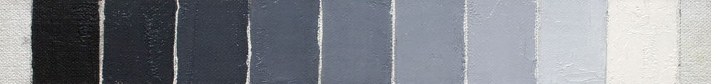
I’ve written before about mixing black and white to make a variety of grays. It’s a nice, simple exercise to better recognize value contrasts. But when painting with more colors, the best way to mix grays is of course to mix complementary colors.
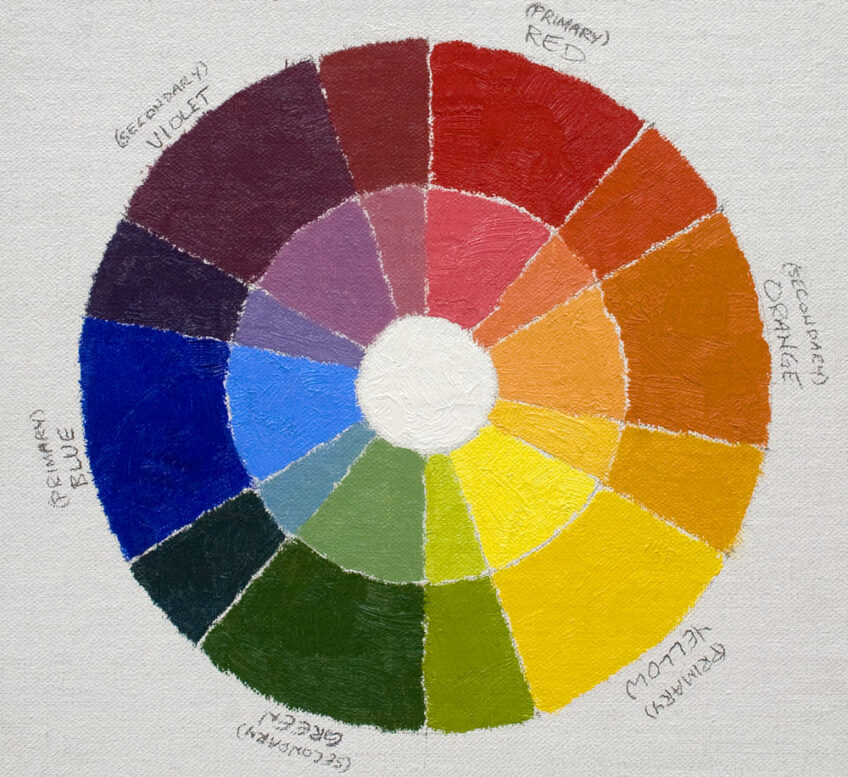
Quick review of your color theory lessons: Colors opposite each other on the color wheel can be mixed together to reduce each other’s color intensity, creating grays. (The addition of white will make the graying more apparent.)
Why is complementary color mixing important, you ask? Because we can mix more accurate, clean and exciting grays than when mixing only black and white.
It’s helpful to realize that many (perhaps most) of the colors we see in our subjects are muted. Grayed. We rarely apply a pure color straight out of the tube directly onto a painting. Our colors almost always have to be grayed to some extent in order to accurately match the colors of nature. And the grayed colors we see aren’t made up of just black and white. They have specific color characteristics. (One reason I think many instructors have taught to avoid using black altogether.) Fortunately, each complementary mixture gives us a uniquely colored gray, so we have a vast number of gray mixtures at our disposal for any situation.
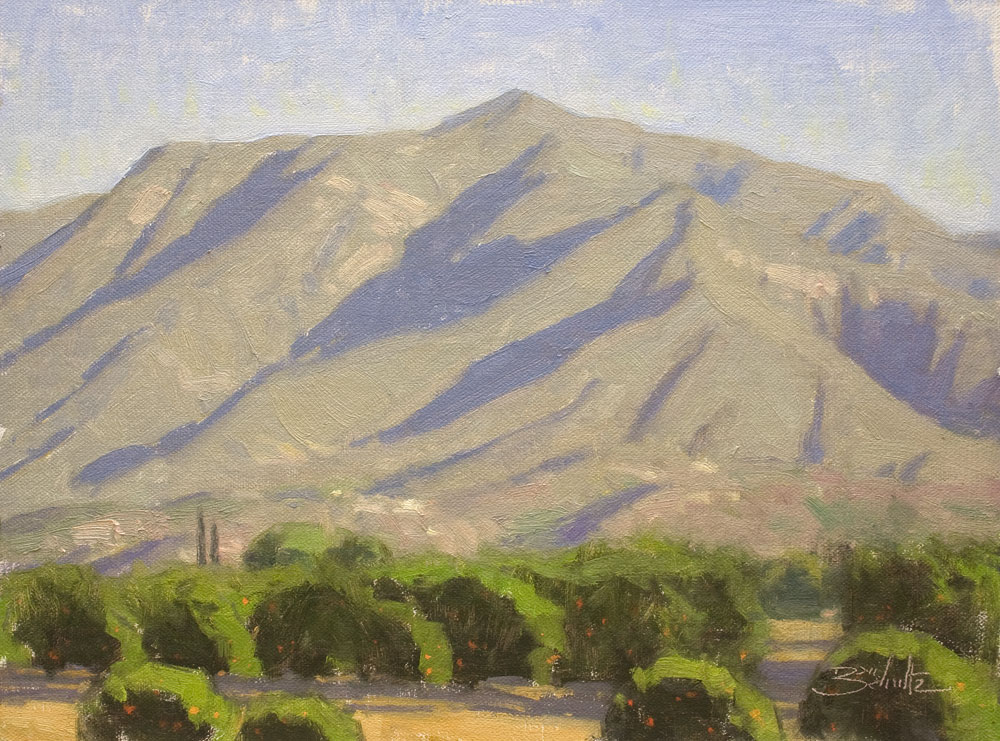
As you practice over time, you’ll find that certain complementary mixtures are perfect for mixing specific colors you see in your subject. A practical example from my plein air excursions: I’ve found that a red / green complementary mixture is often well-suited for matching the color of the sunlit areas on the mountains here in Southern California. (See my pictured painting, Ojai Morning Light.) Anthraquinone Red (or Permanent Alizarin Crimson) + Viridian Green + Titanium White. Sometimes a slight bit of Yellow Ochre is also necessary to push the gray to the exact right color, but the foundation is the red / green complementary mixture. By the way, if you’re saying to yourself, “Dan’s mountains still look pretty green to me,” be sure to compare visually with the greens in the foreground trees and you’ll see that the mountain color is much, much grayer.
While you’ll want to avoid becoming too formulaic in your color mixing, over time you’ll be able to recognize certain grays you see in your subject as being made up of specific complementary mixtures. Just like my red / green mountains. Then you’ll understand even more how much gray matters.
P. S. Did I mention that those beautiful gray mixtures will make the intense colors in your paintings really sing?
11 Responses
Diane
Thanks for this extremely helpful and practical post, Dan, but most of all I appreciate your clever title!
Michael Baum
Valuable advice as always.
Kay Zetlmaier
I’m sending this along to reinforce the importance grays to my art students from your perspective as well. Thanks Dan.
Sherri Trout
Thank you for the reminders in graying and how we sometimes forget the basics that really make our paintings pop. Your always an inspiration to me Dan.
Stefan Ullrich
Great post Dan,
I am gonna try the Zorn’s palette, too. Some artists use black, but avoid ivory black and use a chromatic black instead of. Have you ever compared both blacks and would you see advantages in using the chromatic black?
Stefan from Bavaria
Deborah Lazar
Well said.
Dan Schultz
Thanks for the comments, everyone. Stefan, I’ve never tried chromatic black so I don’t know how it compares to ivory black. Good luck with your Zorn palette work!
Kymee
Chromatic black and yellow makes the prettiest greens and of use white to tint
Stephanie Johnson
You always make it look so easy! I’m sure it comes from your years of practice. Beautiful painting, as always!
Rob Impellizzeri
Thanks Dan for a clear concise post with very helpful images and color descriptions!
My understanding is that Gamblin Chromatic Black is a combination of two modern organic transparent colors Quinacridone Red and Phthalo Emerald. When mixed with yellow it makes a warm green.
Gayle Martin
Thank you, Dan, for sharing your keen observations and knowledge of color. Always appreciated.