Understanding color intensity is important for any painter. Color intensity (or color saturation) joins value and hue as one of the three most important characteristics of color. We use these three characteristics to identify and mix the colors we see.
The Three Characteristics of Color:
1. Value
Value is the degree of lightness or darkness of a color. Every color has its own inherent value.
2. Hue
Hue is the name of any given color (i.e. cadmium orange, ultramarine blue, etc.). I sometimes think of hue as the color family of a particular color.
3. Intensity
Intensity is the purity or saturation of a color. Colors are at their maximum intensity when squeezed out of the tube.
Once we identify colors we see using the above characteristics, we can more easily understand how to mix them with our paint.
Understanding Color Intensity
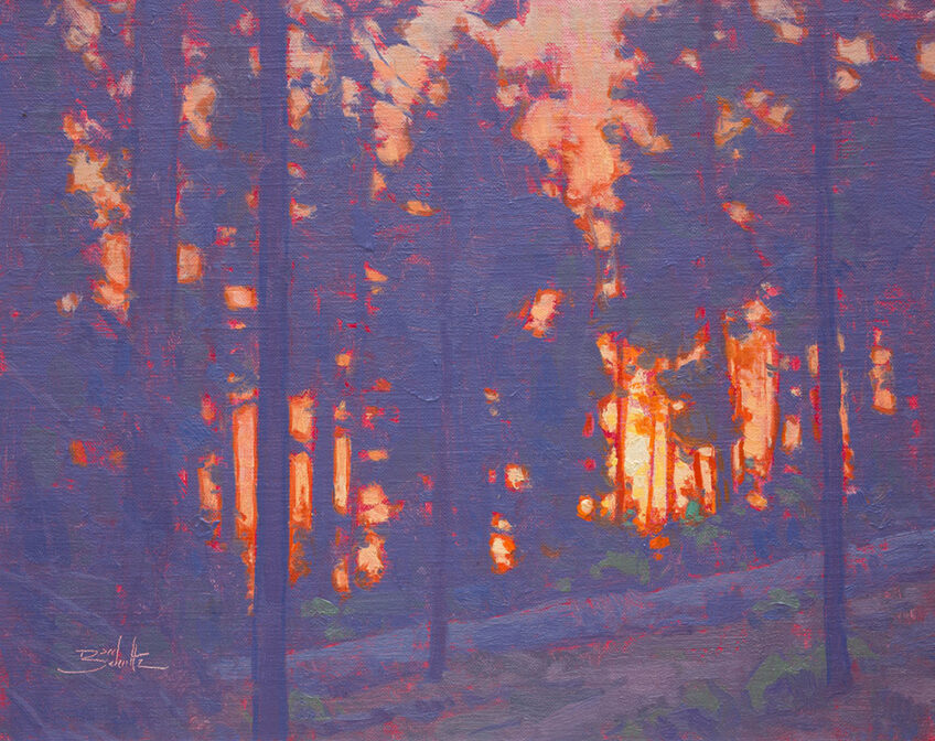
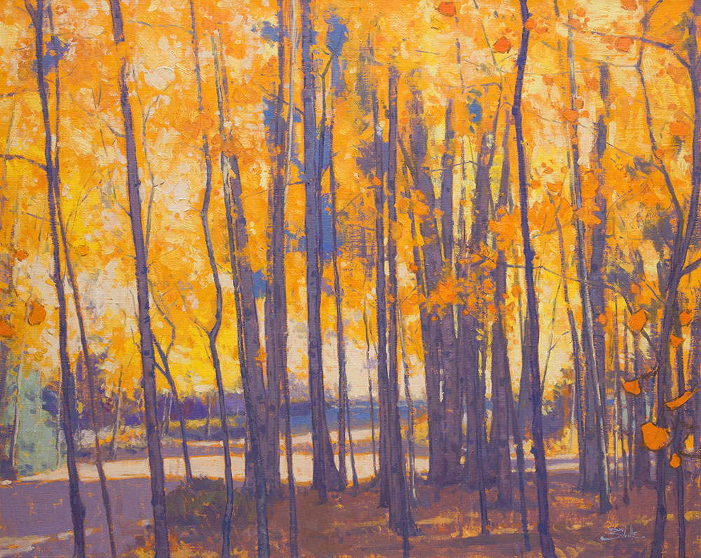
When I begin a painting, I find it helpful to identify the most intense colors in the scene I’ve chosen to paint. Knowing this helps me as I mix my colors to achieve proper relationships between the more intense and less intense colors.
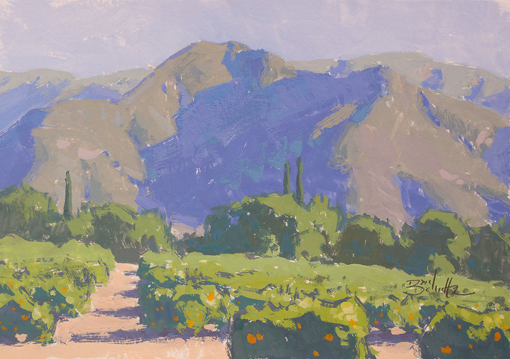
The less intense colors almost always have some percentage of each primary color (red, yellow and blue) in their mixtures, which reduce intensity when mixed together. I’ve found that realization to be particularly helpful. When we mix two complementary colors together to reduce intensity, we’re actually mixing all three primary colors together. For example, when we add a bit of red to a green mixture to reduce the intensity of the green, we’ve actually mixed red with yellow and blue (the green).
But when mixing the most intense colors, I’m careful not to add unnecessary colors into those mixtures. The more intense colors often don’t have more than two of the primary colors included. If they do include the third primary color, it’s a very small percentage.
Getting There
Having trouble recognizing color intensity? The best way to improve your color recognition overall is to paint a lot. I think painting outside (plein air painting) will generate improvement the fastest.
Each time you paint, take the necessary time to do your best to match the colors you’re mixing with the colors in your scene.
You can also make a set of color charts. It’s a tedious exercise, but it will help you understand all the color combinations that are possible from your chosen palette colors.
I hope these thoughts will help you on your way toward understanding color intensity. Keep your brushes moving!
7 Responses
Gayle Martin
Thank you for sharing your knowledge. Hope you and your family stay safe out there.
Mandy Adendorff
Thanks this is rally helpful!
Natasha Ruschka
Thanks Dan, I just spent 4 hours yesterday on a failed painting and declared to my husband that I”lol never be able to paint. After reading this, I see now, that I am just using colour incorrectly. Thank you for taking the time to create these instructions. They are so very helpful. I have the confidence to go back to the easel again.
Dan Schultz
All artists know that feeling of failure. We have to face a lot of failed paintings along our paths to improvement. I’m glad you found some encouragement from my article and are going to keep at it!
Nour Hassan
I love this, thank you so much for sharing your advice!
erotik
I blog frequently and I really thank you for your content. Fan Clare Swayder
Easy Flower Drawings
Really insightful, Dan! Understanding the balance between value, hue, and intensity is key in painting. Your tips on color mixing are incredibly helpful.