
We painters are faced with a number of decisions when starting a new piece. Among these is whether to paint directly on the white canvas or to first apply a wash of color as an underpainting. In this post I’d like to share several benefits of underpainting in oils. An underpainting can make a big impact on the look of a finished painting.
Let me clarify that I’m referring to underpainting as a simple wash of color. Some artists use the term “underpainting” to describe a more developed value study of their scene with all the shapes defined and rendered in one or two colors of paint. This is often done using earth tones or grays in a full-value range of lights, mid tones and darks. (You may hear it defined as a “grisaille.”) That kind of underpainting is then painted over with the proper colors of the scene to finish the painting. I personally haven’t found that to be of much use in my process, but perhaps I’ll talk about it in a future post.
How to Apply
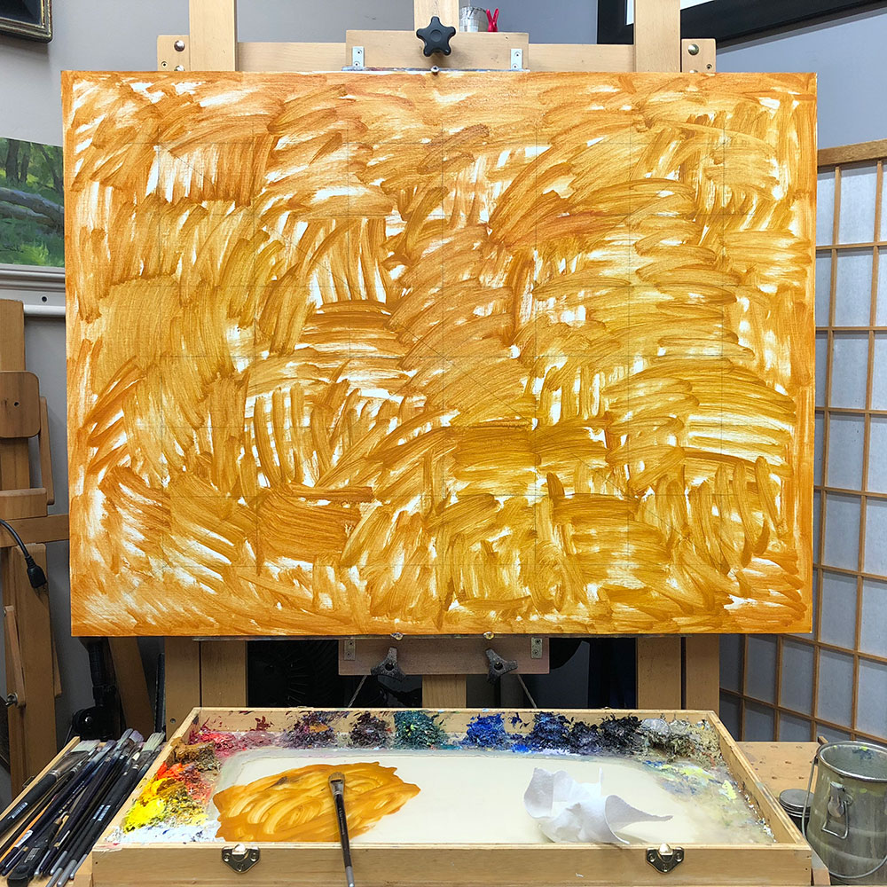
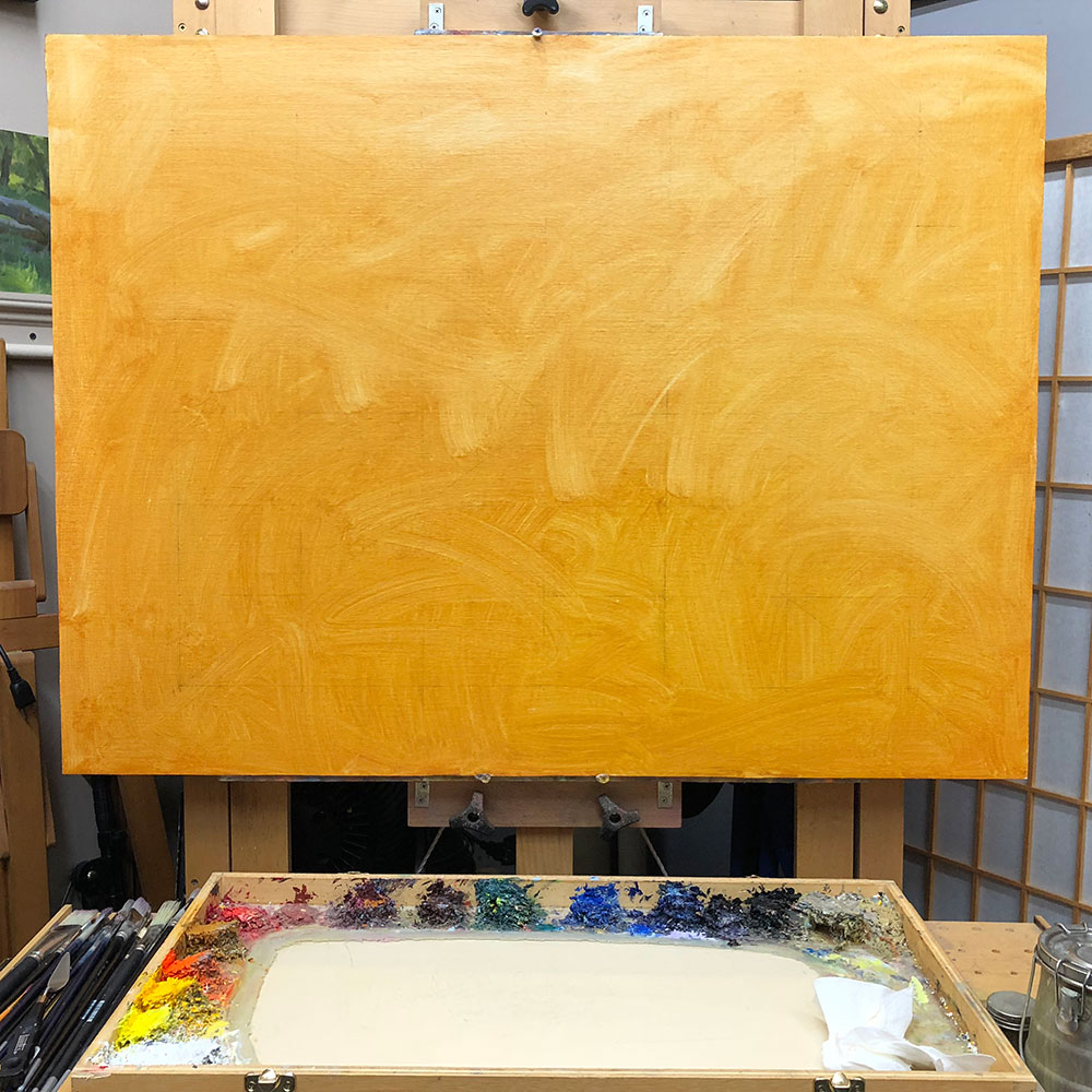
The process of applying a wash of color as an underpainting is pretty simple. First, choose your color and mix up a generous portion of it on your palette. Then thin it into a somewhat runny consistency with mineral spirits and apply it to your canvas with a large bristle brush. Finally, wipe an absorbent paper towel across the surface of the canvas to unify the color and to remove the excess wetness. The color that remains is your underpainting color. You should then be able to paint right on top of it. (Or you can wait until it dries before continuing the painting.)
Benefits of Underpainting
So what are the benefits of underpainting? Let’s group them into the categories of feel, value and color.
Feel
A canvas coated with an underpainting accepts paint differently than a blank, white canvas. It feels different. (Try it both ways and see what you think.) You may find that the feel of an underpainted surface is helpful in your process.
A word of caution: if you plan on painting wet-into-wet, a freshly-applied underpainting can easily mix with colors painted on top of it. Until you’re able to control that aspect it can be wise to let the underpainting dry before continuing the painting. However, you may find some advantages in allowing the underpainting color to mix with your other colors.
Value
An underpainting can quickly change the value of your canvas from bright white to something closer to the overall value of the scene you’re painting. This can make it easier to judge value and color relationships.
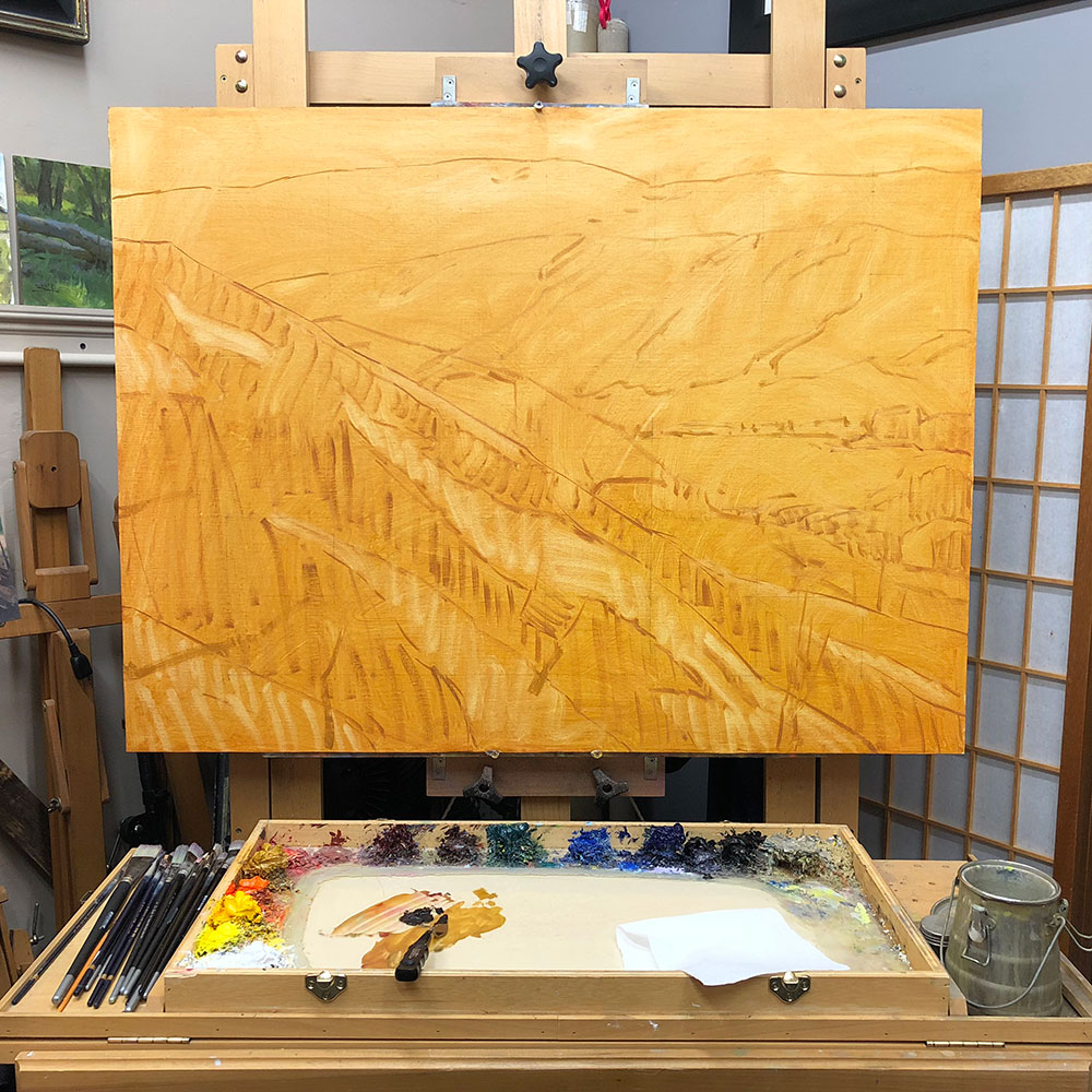
Once applied, you can proceed to cover up all of the underpainting as you complete the painting. Or you can allow the underpainting color to peek through in strategic places across the canvas to achieve desired effects.
If you choose to let it peek through, be mindful that the value you choose for your underpainting color will affect the look of the finished painting. If it’s a very light value under a dark painting (or vice versa), the underpainting will be prominently visible and perhaps distracting. I find that keeping the value of the underpainting color close to the overall value of the scene allows it to affect the colors of the painting without becoming distracting in value.
You may of course choose to underpaint different areas of your canvas with different colors. For example, you might choose a color that’s light in value for the sky area of your scene and a darker color for the rest of the scene.
Color
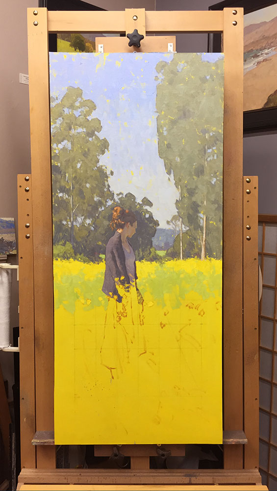
An underpainting can help create harmony. For example, you might choose to underpaint with yellow ochre if the scene you’re painting includes a large golden wheat field. The bits of yellow ochre that peek through between the other colors can help create harmony.
An underpainting can help create a more colorful painting. For example, on a gray overcast day, using an intense yellow or orange underpainting can add some color excitement to what might otherwise be a boring gray painting. (As long as you make sure some of the underpainting remains visible.)
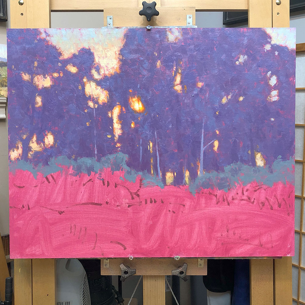
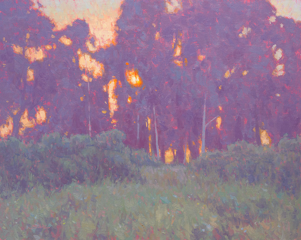
An underpainting can enhance a color effect. You might choose an underpainting color that’s opposite of the overall color harmony in the scene you’re painting. (Opposite on the color wheel.) For example, a red or pink underpainting for a predominately green scene.
I hope this discussion has been helpful to you as you learn more about the benefits of underpainting. You can see the finished versions of all of the paintings pictured in progress in this post by clicking the following links.
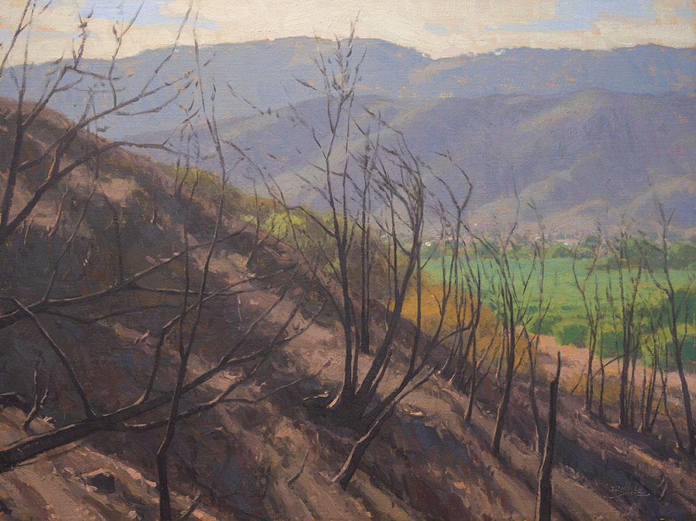
Ojai After the Thomas Fire • 30×40 inches • Oil on Linen Panel • 2018
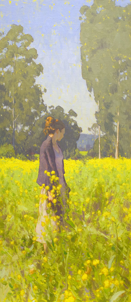
Bright Meadow • 48×21 inches • Oil on Linen Panel • 2018
Cool Evening • 24×30 inches • Oil on Linen Panel • 2019
Have other thoughts about underpainting? Leave a comment below!
27 Responses
Rob Impellizzeri
Great post Dan, thanks!
I have also experimented with sketching in a few of the large shapes with the under painting mixture. For example in a seascape I might rough in the cliffs and sand with the underpainting mixture and leave the sky for direct painting later.
Dan Schultz
Good idea Rob — keeping the sky color clean is much easier without a wet underpainting layer to deal with.
Paula Brown
Thanks Dan! Love this article and it also applies nicely to pastel painting…just different media. Really like the new color bright work you are doing!!!
Dan Schultz
Thanks Paula — fun to see you the other day!
Peggy
I tend to always use a grey unerpaint colour. Your colour suggestions here are very helpful. Thank you.
Lila M Bartel
I am a watercolorist and it rings true for me too.
Making an abstract on the canvas before painting is lovely.
I start with yellow.
Joanne Kegel
Thank you for a subject that interests me. I was especially taken with the under painting for Cool Evening.
Fern Barishman
Thanks Dan. I’m still painting, but not portraits. LOL I always get SO much from your emails.
I’ve been using the “opposite color” for my underpaintings and it makes a huge difference.
Forrest
I’m very late to this discussion… but I wonder if you might have some examples of what your works look like underpainted with the opposite color(s). I have also considered using a dayglo color, wondering what impact and effect that might have on the final work.
Dan Schultz
Here are a few examples. I most often use the opposite color technique when painting an overly green scene, using pink as the undertone.
https://www.danschultzfineart.com/artwork/figures-dan-schultz/#!https://www.danschultzfineart.com/wp-content/uploads/2017/01/wandering-30×30-oil-painting-dan-schultz.jpg
https://www.danschultzfineart.com/artwork/landscapes-dan-schultz/#!https://www.danschultzfineart.com/wp-content/uploads/2020/02/morning-meadow-8×10-plein-air-oil-painting-dan-schultz.jpg
https://www.danschultzfineart.com/artwork/landscapes-dan-schultz/#!https://www.danschultzfineart.com/wp-content/uploads/2017/01/beneath-the-trees-30×40-oil-painting-dan-schultz.jpg
Forrest Aldrich
Thanks for the examples. There is a really good book by Michael Wilcox, Glazing With an Emphasis on the Craft of Painting which really goes deeply into how light and pigment interact. https://michaelwilcoxschoolofcolour.com/product/glazing-with-an-emphasis-on-the-craft-of-painting/
This changed my perspective on how I use color, and there’s so much to learn.
I am not familiar with the properties of dayglo color, as in what/if they are different and how their inherent properties might impact upper layers. I’ll have to experiment. It may be it won’t do much without the full force of light.
Linda Lopez
super helpful….thank you. i a baby in oils. just made the transition from acrylics.
Samee Samia
I appreciate the info however the technique you refer to is toning of the canvas as oppose to underpainting which is as you describe. That would clarify any confusion concerning to two techniques.
Lesleigh Edwards
I’ve been painting for quite a few years and am still learning. I like to underpaint and most times I let it dry except where I want it to blend in. I welcome any help I can get to enable me to achieve what I am aiming for in a painting.
Thank you for sharing your expertise. It is most welcome.
Cheers Lesleigh
Maryvic Morala
I never truly understood why artists do underpaintings, not until I came across this valuable information. Truly an eye opener. Does this apply to acrylics too?
Dan Schultz
Yes this technique works great with acrylic too. In fact, some artists will use acrylic for the initial tone on the canvas (since it dries so fast), then paint over it with oil.
Leslie Burch Sternstein
I am so glad to hear you say that! I started w acrylics & after 10 years switched to oils. When the mood strikes, I might do small acrylics. Somewhere along the way, I was told not to mix the two for fear of cracking. This is a huge relief!
Maia
Crackling can occur if you try to paint acrylic over oil, but it’s usually fine to paint oil over acrylic, once it’s dry.
David Walker
It’s fantastic to learn that underpainting can change the value of your canvas when painting. My sister is wanting to become an artist and she was wondering how she could raise the value of her paintings. I’ll be sure to tell her that she should learn about underpainting with her canvases.
Lee Ann Costello
I used to underpaintin haven t painted in awhile and have been sketching on white canvas but having problems with value think ill try this again
June Forman
I began under painting when I first realized that I seldom used red. I was way too cautious with it and would always grab it last. It felt so strong to me. When I use alizarin red as an under painting its liberating! Thru the years I have grown more comfortable letting my red show. It felt painterly. I guess underpainting was the path to my comfort with the color I had been avoiding. Yes!
Caroline Grenville
This is a really helpful blog. Do you have a view on the difference between using opaque and transparent colours for toning your canvas?
Dan Schultz
Hi Caroline,
I don’t think it matters whether you use opaque or transparent colors when toning the canvas. Either way you’re diluting the colors with mineral spirits so they both become transparent as you cover the canvas. For example, I sometimes use yellow ochre (opaque) and sometimes use anthraquinone red (permanent alizarin crimson, transparent). Toning works fine either way.
Lisa Vento
Using a transparent color DOES matter if you want to use a drawing to show through. I find it easy to take a cloth and PULL color OUT in lighter areas so I can start to see form in values even in this layer.
Terri
I’m a forever learning artist, am I to understand if you use opposite colors for the underpainting it makes the colors pop and vibrate? If you use colors close to each other on the wheel does that just deepen the color or is there ever a time to use them close on the wheel?
Dan Schultz
Hi Terri,
Yes, using opposite colors for an underpainting can create a sense of vibration, but as mentioned above, you should try to control the value of the underpainting so that it is similar to the value of the colors you’re painting on top. (Otherwise the underpainting color usually becomes distracting.) You can use any color for an underpainting. I will often use yellow ochre since it often appears in the landscape I’m painting anyway and will help create overall harmony and warmth. I have tried yellows, greens, blues, purples, browns, oranges, and pinks in different situations and for different color ideas. I would recommend trying them all and seeing how each color affects your paintings.
Paul Casperson
Always enjoy your analyses, Dan. I stopped painting during COVID, but I’m trying to get back to it. Your articles always inspire me.
Thanks again,
pc