If you’ve been painting long, you’ve probably come to realize the importance of value relationships. And it’s likely due in part to at least one instructor’s endless reminders to SQUINT!
Value (light/dark contrast) is a critical part of any successful representational painting or drawing. After design and drawing accuracy, it’s the next most important factor. No matter how strong in design, how impeccable in drawing accuracy, how refined in color or how varied in edge work, without proper value relationships, a painting will be lacking.
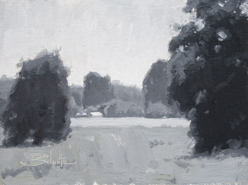
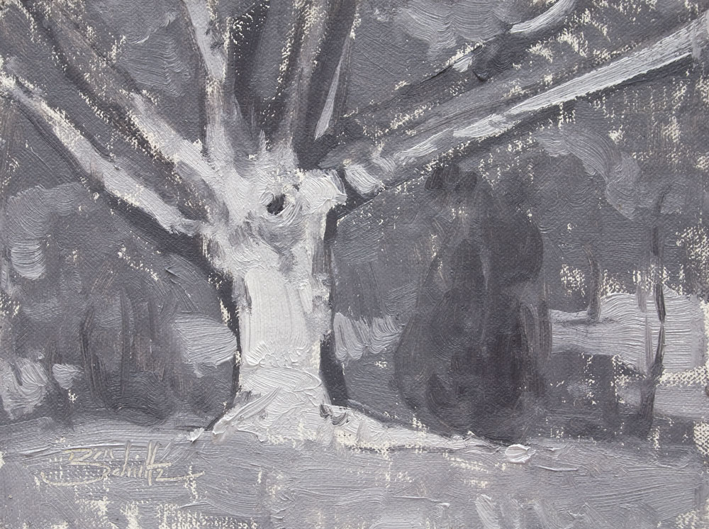
A monochromatic medium such as graphite or charcoal is, of course, a great way to focus on value. But painters will also benefit from painting with just black and white. The practice will improve value recognition and (especially helpful for beginners) provide experience with paint mixing and brush handling.
So head outdoors or into the studio armed with your tubes of black and white. And remember, the study of value is a valuable study. Also, when you say that to your friends you’ll sound really clever!
(By the way, for those of you who didn’t get the “squint” reference, squinting your eyes makes it easier to compare value relationships.)
The pictured paintings are two of my value studies created with Titanium White and Ivory Black.
6 Responses
Corey Fowler
Excellent advice for anyone who wants to create wonderful oils or paintings in any medium as well… When I first started painting I studied the works of old masters and found that they would have their apprentices draw in only bxw or conte’… I discovered as Dan suggests above that the reason is to train the eye to discern the difference between light intensity and color intensity… In the beginning it’s really tricky and my first color paintings were really out of whack and out of light/color balance… Gradually though, I began to see the difference between color intensity and light intensity and the results have been most rewarding! Again, great advice Dan!
Dan Schultz
Thanks for your added insight, Corey!
Gray Matters
[…] written before about mixing black and white to make a variety of grays. It’s a nice, simple exercise to better recognize value contrasts. But when painting with […]
Jessica Janell
Thank you Dan! This reminder was due for me.
Sergio Lopez
“The Study Of Value Is A Valuable Study” –make a t-shirt!
Dan Schultz
Haha good idea Sergio!