
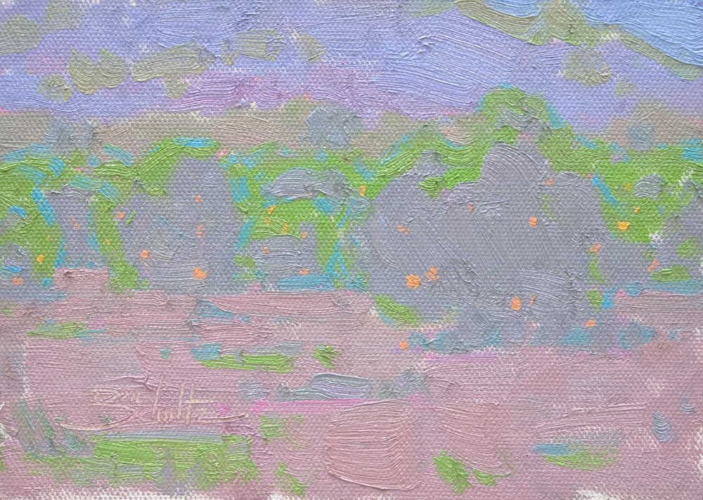
You’ve probably seen at least a few paintings that were created with just one color. Monochromatic is the fancy term for them. I’ve tried my hand at a few. But I recently wondered: Can I create a painting with just one value, while still retaining color separations? A mono-value painting? I thought it would be a good exercise for exploring color temperature. So I tried it.
VALUE: Value is one element we often rely on to create the illusions of form and depth in painting. Areas in a scene which are in direct light are usually lighter in value than areas in shadow. This helps us create form. Dark values are usually in the foreground and tend to get lighter as they recede into the distance. This helps us create depth.
COLOR TEMPERATURE: Color temperature works hand-in-hand with value. As we study color temperature we find that light areas are usually of the opposite color temperature than shadow areas. This helps us create form. Colors in the distance tend to be cooler in temperature than colors in the foreground. This helps us create depth.
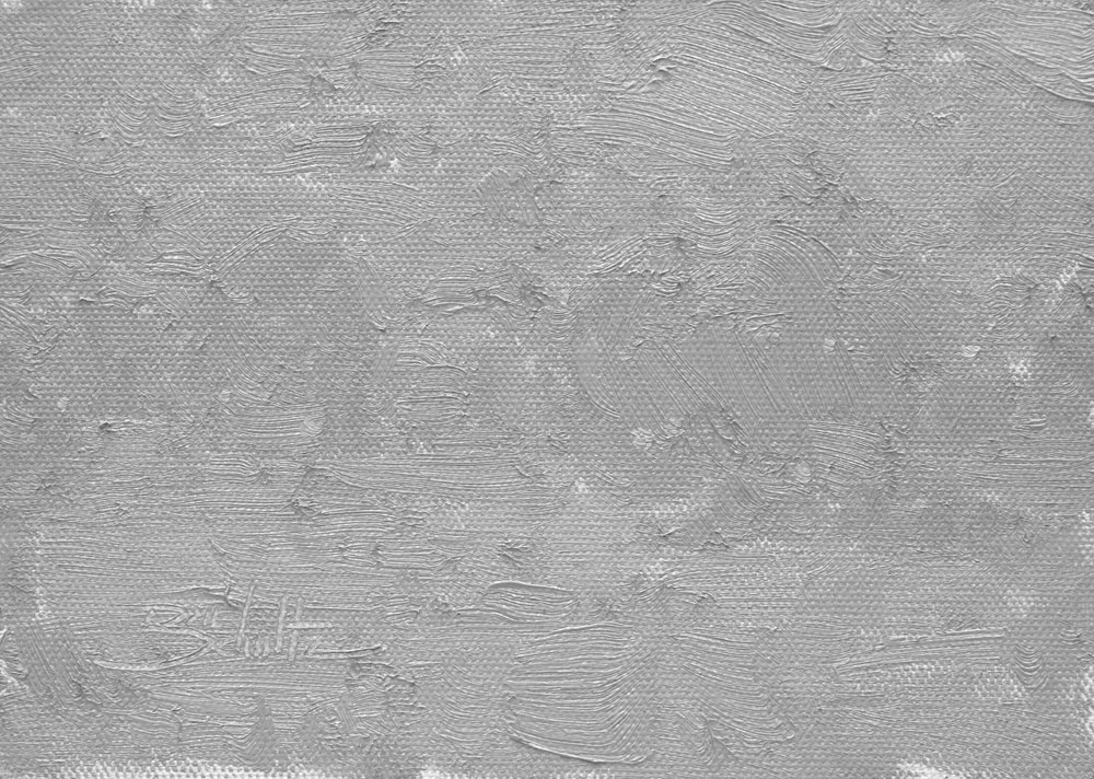
So, for this mono-value experiment, if we take away value changes, we must then rely only on color temperature to create form and depth. As you can see in the grayscale image of my painting, I came pretty close to achieving a single value. Obviously, without value changes the painting doesn’t have any contrast, which results in little visual impact. But a sense of form and depth is still present due to the color temperature shifts.
A great exercise for exploring color temperature. Try it sometime!
11 Responses
Ed
Dan, thanks for this lesson in color value. I now understand this principle much better than I did before!
Ed Draney
Gary bradley
Good exercise thanks for the effort
Diane
Thanks for the very clear explanation of all the things that make a painting great. I will use this now hopefully to a happy ending in my paintings.
Robert Impellizzeri
Dan – Well explained and well executed. Thanks for the insight!
Made wonder what artists might paint in this way. Dan Pinkham came to mind.
Rob
Dan Schultz
I appreciate your comments, everyone!
Ann Larsen
Thanks Dan. Great explanation. I am going to try this. Sometimes I think the most striking paintings are those with close values, as some of your work is. This just adds another dimension.
Chrissy
I came across this study while searching for images to teach my 2nd grade class about the art elements of value and color. Very helpful, do you mind if I show them a slide of the image in color and then black and white?
Dan Schultz
You’re welcome to share the images with your class. Thanks for asking. 🙂
John Tullis
It’s amazing that you’re teaching principles of value and color to second graders! I’m trying to teach these things to adults, and it’s not easy for them to grasp!😂
Gaye
Love this!
Lee Edwards
Thanks for the helpful descriptions contrasting value with color. I am reminded of the paintings of John Twachtman who lived from 1853 to 1902. He was something of a Tonalist. Especially his winter scenes have very low contrast, very light in value but with subtle color shifts that really define the shapes. As I see from your example it is refreshing to see a painting which does not follow the usual formula of a wide range of dark and light value contrast.