Design (or you could call it Composition) is the Number One principle in the fundamentals of visual art. You may have heard a wild-eyed instructor in art class exclaim, “Composition is King!” With a greater focus on composition, you can design your way to better paintings.
Early Study
In 2001, I was making a determined effort to learn how to paint the landscape outdoors. I had been working as a graphic designer for a few years, so I felt like I had a good handle on design. But I wanted to improve in basic painting principles like color mixing and understanding the effects of light outdoors.
I took a workshop that year from landscape painter Skip Whitcomb. He gave a great workshop with focused training in the fundamentals that I wanted to learn. And he spent a lot of time highlighting the importance of design. Like I mentioned, I was feeling pretty good about my understanding of design. It had been a big part of my commercial art and graphic design training. So I placed most of my focus on the other things Skip was teaching.
My continued practice after the workshop made me recognize the many areas in which I still needed improvement (basically all of them), so I took another workshop the next year, this time from Matt Smith. His teaching guided me to some great “Aha!” moments of understanding. And he also spent a lot of time reminding us of the importance of design.
By this time I began to realize that I wasn’t quite as good at design as I thought I was. I wasn’t actually giving it enough attention. Both Whitcomb and Smith, at the top of the landscape painting genre, continued to give focused attention to design in their work. It wasn’t an afterthought. It was the first thought.
Here’s the thing. A strong design will give power to your artwork. Without it, no matter how well you handle the other elements (value, color, paint application, edge handling, etc.), your painting will lack the strength it could have had.
Design Your Way to Better Paintings
So how do you compose your scene to create a strong design? Here are a few tips as you begin a new painting:
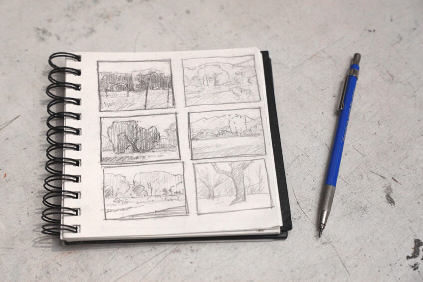
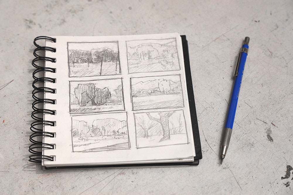
- Start by drawing a few small pencil sketches of the scene in different formats. Try the scene as a square, or as a vertical rectangle. Or as the tried-and-true horizontal landscape format.
- Zoom in on what interests you most about your subject. What parts of the scene could be cropped out to highlight the parts that are grabbing your attention?
- Visualize your subject as an arrangement of two-dimensional shapes. One shape next to another. What shapes can you combine? What shapes should be separated or removed? Simplify as much as possible. (Remember, simplicity equals strength.)
- For help with simplifying, try breaking down your subject into just two or three value masses. (Search online for “landscape notan” images to see what I mean.)
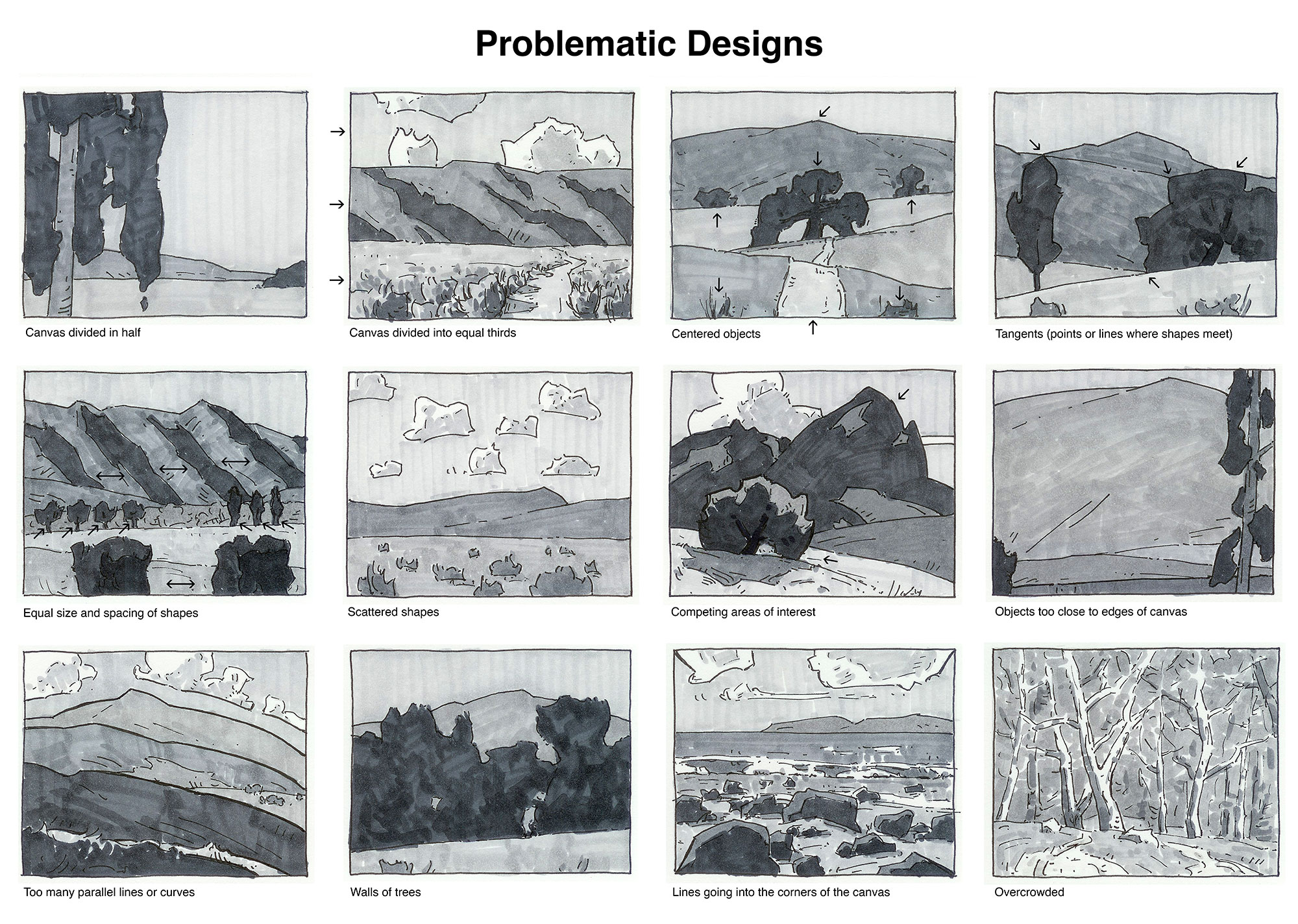
- Watch out for problematic designs such as:
- dividing your canvas into equal halves or thirds
- centered objects
- elements spaced or sized too equally
- areas of interest placed too close to the edges of the canvas
- crowded designs
- overly scattered shapes
- excessive repetition
- tangents (points or lines where shapes meet)
- Don’t rush the design stage. Make sure you feel good about your composition before beginning to paint. It’s very unlikely that you’ll create a strong design accidentally by just blundering onward before you work out a good design idea.
Further Study
I highly recommend Edgar Payne’s book Composition of Outdoor Painting for further study on design. Some of his sketches in the book inspired me to create my examples of problematic designs shown above.
For even more design study, check out my video lessons at Sentient Academy. I’ll walk you through design principles and show you how to sketch helpful thumbnails as you generate design ideas.
I’ve realized that design is often what first draws my attention when I’m choosing a scene to paint. And it seems to attract more and more of my focus as I continue my efforts as an artist. I hope as you keep these ideas in mind they will help you design your way to better paintings too.
P.S. While considering those problematic design guidelines, realize that now and then artists have successfully broken those guidelines. Maybe you’ll want to take it as a personal challenge to break them yourself and really feel like a rebel!
6 Responses
Julianna
The problematic design sketches are so very helpful! Thank you for helping me visualize it. I will definitely save this for future reference.
Bobbi Dunlop
Thanks, Dan, for this great tutorial. It’s so helpful, not to mention, inspiring, as I look forward to our plein air season. Your informative newsletters are always so appreciated and I fondly recall your workshop I attended all those years ago! Bobbi
Dan Schultz
Nice to hear from you, Bobbi — your work is looking beautiful as always!
Diana
Thanks so much. I appreciate that you are sharing your tested and true knowledge.
Diane Zusman
Great tutorial on composition. Thankfully my art teacher has taught these to me and I think about them automatically when creating my pastels. It seems so obvious, but if one has not had this pointed out it is a pitfall. Looking forward to your new creations of this springtime bonanza.
Joshua
Amazing