Have you been looking for relationship advice? I can help! While the following may not help much (or at all) with your human relationships, I do have a few tips to help you achieve better color relationships.
We artists want our colors to work in harmony. But if you’ve been painting for any length of time at all, you know that harmony isn’t always easy to achieve. Color temperatures can be askew, values can be in the wrong range, saturation can get out of hand. It can take a lot of brush strokes to get things right.
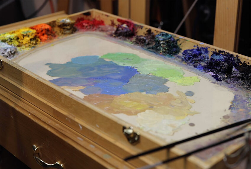
At some point along the way I realized something helpful. All the colors available for my painting were present on my palette. I had the whole range of value from light to dark. All the primary colors and some secondary colors were there. Why not use those palette colors to compare the color relationships for my painting?
Use Your Palette!
The best way to use your palette to compare color relationships is to mix your colors right next to each other. Check out the time lapse video below to see what I mean. (Just FYI, the video makes it look a little like I premixed the colors, but I didn’t. The video shows the whole duration of the painting session. I mixed each color as I went along.)
Remember that it’s easiest to visually compare colors that are touching each other. Wherever two colors meet in your painting, mix those two colors next to each other on your palette. Let the pools of color actually touch each other. Then you can compare both mixtures to each other in value, hue and saturation. It’s a preview of how those color relationships will appear on your canvas.
I sometimes even put a dab of pure white or black right next to one of my mixtures to compare those really light or dark values.
If you practice working in this fashion while keeping your palette orderly, you can avoid colors that don’t get along. And by not having to make as many color corrections, you might even save yourself some time in the process.
Happy color relationships = happy paintings!
7 Responses
Rani Douglas
Thank you Dan. This is helpful and having the video made it easier to understand.
Fernanda Jimenez
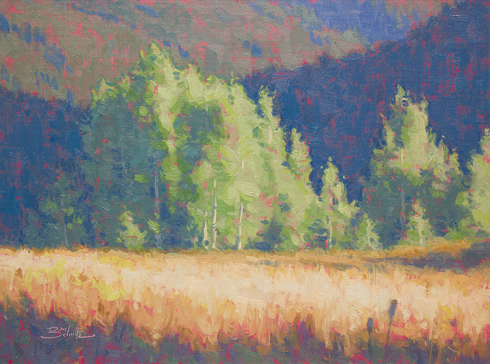
Thank you so much Dan! the colors for that painting are beautiful!!
Jim Sanders
Always welcome your advice. Thanks
Lynn Davis-Smith
Great demonstration, Dan! I especially like the idea of putting a little pure black or white next to the color mixes.
Karen Storm Solorzano
Thank you, Dan, for sharing this very valuable information.
Rob Impellizzeri
Great advice Dan! I’ve tried premixing in the field, but due to changing light conditions I am usually too impatient to do it. Do you do it when plein air painting as well? I’ll give it another try, thanks.
Dan Schultz
Hi Rob — the time lapse makes it look like premixing, but it’s not. The video shows the length of the whole painting session. I mixed each color as I went along. Sorry for any confusion!